
Why Japandi Wall Art Works in Modern Homes
Japandi has lasted longer than most interior trends of the last decade because it was never really a trend. It’s a way of furnishing a home that borrows two older ideas and lets each one correct the other’s weak points.
Japanese minimalism on its own can feel austere in a Western house — too empty, too exacting, built around a discipline most of us weren’t raised with. Scandinavian design on its own can tip the other way: layered throws, objects on every surface, warmth that slowly turns into visual noise. Japandi sits in the middle. It keeps the restraint and honesty of Japanese design — negative space, materials left visibly imperfect, a general refusal to over-decorate — and pairs it with the practicality and tactile warmth of Scandinavian rooms: wood that gets used, textiles that get sat on, spaces that are calm without being cold.

Done well, the result is a room that feels grounded rather than sparse. Nothing is missing. Everything there has a reason to stay.
Wall art is where this either holds together or falls apart. Art is the one element that doesn’t have to hold a drink or seat a guest. It’s judged purely on composition and mood, which makes it the easiest place to get Japandi wrong.
Why low-noise, nature-based art fits
Japandi rooms run on a reduced palette and a slower visual rhythm — a few materials repeated, rather than many competing. Art has to follow the same rule. A piece with high contrast, dense detail or a loud focal point will dominate the room the way a raised voice dominates a quiet conversation. It doesn’t matter how strong the piece is on its own; it’s working against the space rather than with it.
Nature-based subjects — landscapes, plant forms, studies of texture and light, abstracts built from organic shapes — tend to work for this reason. They’re not automatically calmer than other subjects, but they lend themselves to the kind of composition Japandi needs: fewer elements, more breathing room, nothing that demands attention on first glance. The best pieces reward a second, slower look.
Negative space does real work
In a lot of minimal interior photography, empty wall is treated as a stylistic flourish — left blank because blank looks good in a photo. In Japandi it’s structural. The space around a piece of art is as considered as the piece itself. One framed print on an otherwise bare wall isn’t an unfinished room; it’s the point. The emptiness gives the work somewhere to exist without competition.
That has a practical consequence when you’re buying: resist the urge to fill every wall. A Japandi room usually needs fewer, more deliberate choices — one correctly scaled and placed piece rather than a gallery of six smaller ones. If you’re working out proportions for a specific room, the [Japandi Wall Art Styling Guide] goes into this in more detail.
Muted palettes aren’t just “beige”
Japandi colour often gets reduced to “neutrals,” which is true but too vague to be useful. The palette that actually works comes from raw materials: the grey of unfinished stone, the warm brown of oak, the off-white of linen, the soft black of ink, muted clay and sand. These aren’t decorating colours chosen to be inoffensive. They’re colours already present in the materials around the art, which is why they sit so comfortably together.
Subject matter follows the same logic. A nature-based image in saturated, high-chroma colour works against the room even if the composition is quiet. The same subject in restrained, tonal colour — close in value, closer to the materials in the room than to a colour wheel — does the opposite. It reads as part of the room’s material language rather than something added on top.
Real Japandi art versus generic “minimal” or “zen” prints
A lot of wall art sold under this label falls short here. “Minimal” has become a shorthand — a single line, plenty of white space, maybe a circle standing in for the sun or moon. “Zen” often means the obvious references: bamboo, stacked stones, brushwork used as decoration rather than meaning. None of these are automatically wrong, but they’re frequently generic. They borrow the surface signals of restraint without much underneath.
Art that actually suits Japandi tends to have two things the generic versions often miss: a sense of material honesty (texture, grain, visible process — the wabi-sabi idea that age and imperfection aren’t flaws to hide) and a composition that has been properly considered, not just left sparse by default. A piece can contain very little and still be badly balanced, awkwardly cropped, or empty in a way that feels unfinished rather than intentional. The difference isn’t how much is in the frame. It’s whether what’s there, and what isn’t, has been thought through. The [Japandi Wall Art Buying Guide] covers how to judge this when you’re choosing.

Framed or canvas: the difference is real
In a Japandi room this choice changes the character of the piece more than most people expect.
A canvas print, with its slight texture and lack of glass, tends to feel more organic and tactile — closer to the room’s material honesty. It sits into the wall a little, which suits work meant to feel like part of the architecture rather than a separate object.
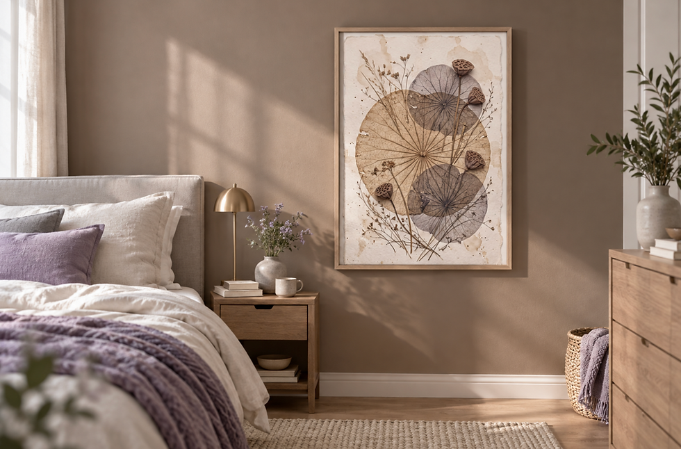
A framed print, especially in a thin wood or matte black frame, introduces a clean edge and a touch more formality. It reads as a considered object, which works well when the piece is meant to be the single deliberate focus on an otherwise empty wall. Wood frames in oak or ash usually integrate better with Japandi’s material palette than metal or glossy finishes, which can feel sharp against all that softness.
Neither is more correct. It depends on whether you want the art to sit quietly within the room’s materials or stand slightly apart as a defined piece.
Pairing art with the rest of the room
Japandi wall art doesn’t work in isolation — it’s chosen in relation to what’s already there. Wood brings warmth and grain that a tonal, textured print can echo. Linen and other soft, loosely woven textiles suggest an informality that suits art with visible texture or a handmade quality over anything too polished. Stone and raw plaster pull in the cooler, greyer end of the palette, which pairs naturally with ink-toned or monochrome pieces. The overall sense should be simple, slightly imperfect, and unforced.
The aim isn’t matching. It’s making sure the art and the materials around it come from the same restrained, tactile world, so the room reads as one considered space rather than a collection of separately chosen things.
If you’re putting this together at home, it’s worth looking at pieces made with this approach from the start rather than trying to adapt generic minimal prints to fit. The Japandi Wall Art Prints collection on Frameifi is organised around exactly these qualities: restrained composition, natural subject matter, and tonal palettes that hold their own next to wood, linen and stone.
— Alexis Lewis, Frameifi


Comments