
Japandi Wall Art Styling Guide for Living Rooms, Bedrooms & More
Knowing why Japandi wall art works is one thing — the reasoning is covered in Why Japandi Wall Art Works in Modern Homes. Getting it on the wall so the room actually feels right is another. The principles are simple, but they’re easy to lose once you’re standing in front of a blank wall with a piece of art and no clear sense of where it belongs.
This guide covers the practical decisions: size, height, spacing, frame choice, and the mistakes that quietly undo an otherwise good room.
Living rooms: get the scale right first
The most common sizing mistake is choosing art that’s too small for the wall. As a working rule, a piece (or a grouped arrangement) above a sofa or console should span roughly 60–75% of the furniture’s width. For an average 84-inch (213 cm) sofa, that means something in the 50–63 inch (127–160 cm) range — larger than most people reach for instinctively.
From there, decide between one piece or two.
A single large work suits Japandi well. It reinforces the idea of one deliberate choice rather than several competing ones, and it works especially well above a low console or a clean-lined sofa, where the art can act as the only real visual anchor on an otherwise calm wall.

A pair makes sense when the wall is wide enough that one piece would feel undersized, or when you want a bit of rhythm without adding busyness. Two pieces of matching or closely related size, hung with even spacing (around 3–4 inches / 7–10 cm if they’re meant to read as a set), feel intentional. Three or more small pieces scattered across the same wall rarely do — they start to look like leftovers rather than a decision.
Height matters as much as width. Centre the art (or the grouping, treated as one unit) so its midpoint sits roughly 57–60 inches (145–152 cm) from the floor — standard eye level — unless it’s above furniture. In that case leave 6–8 inches (15–20 cm) between the top of the furniture and the bottom of the frame. Too little gap and the piece feels cramped; too much and the two elements stop relating to each other.
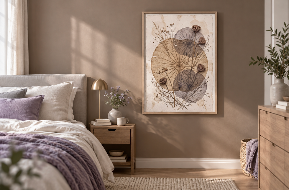
Bedrooms: lower contrast, less movement
Bedrooms need a calmer version of the same rules. This is the room where the usual push for a “statement” piece works against you. High-contrast art — strong blacks against bright whites, sharp graphic shapes — keeps the eye busy when you’re trying to wind down. In a bedroom that’s a cost, not a feature.
Favour softer tonal ranges: muted greys, warm sand, pale ink-wash tones, anything where the darkest and lightest areas sit closer together in value. The composition should feel settled rather than dynamic — more horizontal weight, fewer sharp diagonals or scattered focal points.
Above the bed, keep the same width guideline as the sofa rule — art spanning about 60–75% of the headboard — but be more conservative with pairs and groupings. A single quiet piece centred above the headboard, with generous space around it, does more for the room than a cluster of smaller frames. If you do use two pieces, keep them small, matched and well spaced — more like punctuation than decoration.
Avoid anything with high visual activity directly in the sightline from the bed. It’s the first and last thing you see each day, and a busy piece in that spot works against the room every time you look at it.

Hallways, reading corners and smaller walls
Narrow hallways often get treated as leftover space, which is why they go wrong — people hang whatever didn’t fit elsewhere. A hallway benefits from the same restraint as a main room: one well-placed piece, or a tightly spaced vertical pair, reads as considered. A loose scatter of unrelated small frames reads as clutter, especially in a narrow space where everything is seen close up and in passing.
For a reading corner or a smaller accent wall, scale down deliberately rather than defaulting to a tiny print just because the wall is small. A single piece in the 16×20 inch (40×50 cm) to 24×36 inch (60×90 cm) range, hung at eye level relative to where you’d actually be sitting, tends to work better than something that disappears. These smaller walls are also where quieter, more intimate subjects do well — something you’d want to look at closely while seated, rather than something designed to be read from across a room.

Frames: material and colour matter more than people expect
Light oak and ash frames are close to a default-safe choice in Japandi rooms. They pick up the warmth already present in wood furniture, flooring and trim, and they work especially well with muted, tonal prints, reinforcing the room’s material consistency rather than adding a new element.
Thin black frames do a different job. They add a small amount of definition and contrast without introducing clutter, which is useful when a wall needs one sharper point of focus. Keep the profile thin; a thick or glossy black frame starts to feel heavy and formal in a way that fights the calm.
Natural, slightly raw-finished wood — visible grain, matte rather than lacquered — sits closer to the wabi-sabi end of Japandi and suits rooms already built around unfinished or textured materials.
Canvas, without a frame, is often the better choice when you want the art to feel like part of the wall rather than a separate object. This works particularly well for larger pieces in living rooms, where a frame’s edge can start to feel like one more hard line in a space trying to avoid them.
Steer clear of ornate mouldings, gold leaf and anything heavily lacquered — these read as traditional or formal and work against Japandi’s restraint. Equally, avoid frames that feel clinical: thick white museum-style frames or brushed steel can pull the room toward “minimalist office” instead of the grounded warmth the style is after.
Keeping the wall open
The simplest way to protect the calm of a room is to under-fill it. Leave more wall space than feels natural at first — Japandi rooms rely on that negative space to let the art breathe. When hanging more than one piece, keep spacing consistent and alignment exact; uneven gaps or slightly mismatched heights read as careless in a style that depends on precision.
Coordinate the art with what’s already in the room rather than treating it as a separate decision. Warm oak furniture pairs naturally with warm-toned frames and tonal prints; cooler stone or concrete elements pair better with greyer, ink-based palettes. Muted wall colours give you the most flexibility, but avoid putting a very pale, low-contrast piece against an equally pale wall — it can disappear. A small amount of contrast between wall and art keeps the piece visible without breaking the room’s calm.


Mistakes worth avoiding
Most Japandi styling problems come down to three things: too many small pieces competing for attention instead of one or two considered ones; art with contrast or detail sharp enough to fight the room instead of settling into it; and frames that tip too far in either direction — too ornate, or too clinical and cold.
If you’re still choosing the art itself rather than placing it, the Japandi Wall Art Buying Guide walks through how to tell genuinely suitable pieces from generic minimal prints. When you’re ready to look at work sized and toned for the rooms above, the Japandi Wall Art Prints collection is built around exactly this approach.
— Alexis Lewis, Frameifi


Comments